Australian Standards for Hazard Signs on Construction Sites
Construction sites are risky, and essential safety signs can save lives. The AS 1319-1994 standard sets rules for safety signs, ensuring hazards are clear and easy to understand. It categorises signs into six types – Danger, Warning, Mandatory, Prohibition, Emergency, and Fire – each with specific colours, shapes, and symbols to communicate risks effectively. Compliance not only protects workers but also meets Workplace Health and Safety (WHS) regulations, avoiding fines and legal issues.
Key points:
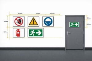
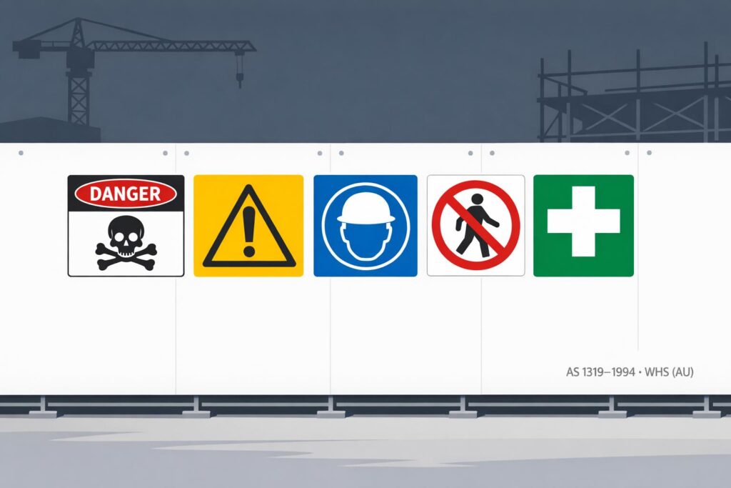
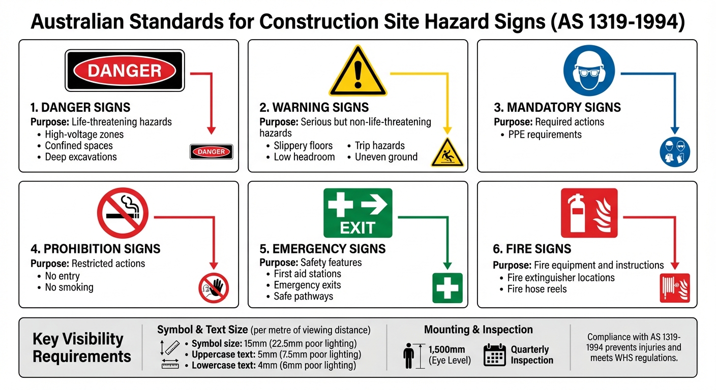
- Danger signs: Red oval, black rectangle, for life-threatening hazards.
- Warning signs: Yellow triangle, for serious but non-lethal risks.
- Mandatory signs: Blue circle, indicating required actions (e.g., PPE).
- Prohibition signs: Red circle with slash, for restricted actions.
- Emergency signs: Green background, for first aid or exits.
- Fire signs: Red background, for fire equipment or instructions.
Signs must be visible, correctly placed, and regularly maintained. For instance, symbols should be 15 mm per metre of viewing distance, increased by 50% in poor lighting. Regular inspections ensure signs remain clean, visible, and relevant as site conditions change.
Following AS 1319-1994 isn’t just about ticking boxes – it’s about preventing injuries and ensuring everyone on-site understands potential risks, no matter their language or background.
Australian AS 1319-1994 Hazard Sign Types and Specifications
Safety Signage
sbb-itb-9950c92
Types of Hazard Signs Under AS 1319-1994
AS 1319-1994 defines two main types of hazard signs, each designed to address risks of varying severity. These signs play a critical role in alerting workers to potential dangers in their environment.
DANGER Signs for Life-Threatening Hazards
DANGER signs are specifically used for hazards that pose a direct threat to life. Their design is standardised: the word "DANGER" appears in bold white letters inside a red oval, which is enclosed within a black rectangle. Any supporting text is printed in black on a white background.
On construction sites, these signs are typically placed in areas such as high-voltage zones, confined spaces, or near deep excavations – locations where a mistake could result in death or severe injuries. The size of the sign must be appropriate for the hazard’s severity and visible from a safe distance, ensuring workers have enough time to act. Placement is key, with signs positioned well before the danger zone.
Warning Signs for Serious but Non-Life-Threatening Hazards
Warning signs address hazards that, while serious, are not immediately life-threatening. These signs are characterised by a yellow triangle with a black border, accompanied by black text or symbols on a yellow background.
Commonly seen on construction sites, these signs warn of risks like slippery floors, low headroom, trip hazards, or uneven ground. Earlier designs used the term "Caution", but AS 1319-1994 now specifies "Warning", although both terms are still recognised.
To maximise their effectiveness, warning signs should be placed thoughtfully. Avoid grouping too many signs in one area, as this can overwhelm or confuse workers. Mounting them on stable surfaces, such as walls, ensures they remain clearly visible and easy to understand.
Design and Visibility Requirements
AS 1319-1994 doesn’t just classify hazard sign types – it also lays out clear guidelines for their design and visibility to ensure they do their job effectively. While the standard doesn’t require fixed sizes, it does provide distance-based recommendations. These ensure that signs remain readable from wherever workers might need to see them. Essentially, the further away the viewer, the larger the sign must be.
Size, Colour, and Text Requirements
Sign dimensions are determined by viewing distance. The standard specifies a minimum size of 15 millimetres per metre of viewing distance for symbols. For example, a symbol meant to be seen from 10 metres away must be at least 150 millimetres tall. Text sizes vary slightly: uppercase letters require 5 millimetres per metre, while lowercase letters need 4 millimetres per metre.
These measurements assume good lighting. In areas with poor lighting or challenging visibility, AS 1319-1994 advises increasing these dimensions by at least 50%. For instance, a symbol that would typically be 150 millimetres tall should be enlarged to 225 millimetres in such conditions.
| Element | Standard Conditions | Poor Lighting/Conditions |
|---|---|---|
| Symbols/Pictograms | 15mm per metre of viewing distance | 22.5mm per metre of viewing distance |
| Uppercase Text | 5mm per metre of viewing distance | 7.5mm per metre of viewing distance |
| Lowercase Text | 4mm per metre of viewing distance | 6mm per metre of viewing distance |
Consistent colour use is another key requirement. Colours must adhere to AS 2700, ensuring uniformity across all signs. For instance, the red used on danger signs must match across the entire site, similar to the requirements for a dangerous goods ID sign. Text must follow the fonts specified in AS 1744 to guarantee clear legibility. These precise standards help create uniform, easily recognisable signage.
Ensuring Signs Are Visible on Construction Sites
Size and colour alone won’t make a sign effective – it also needs to be properly placed and maintained. Signs should be mounted at eye level for immediate visibility and positioned well ahead of hazards to give workers enough time to react.
Contrast is critical. A white sign on a white wall is practically invisible, no matter how large it is. Signs must stand out sharply against their background. On construction sites, this means avoiding areas where they might blend in with materials, machinery, or structures.
Obstructions can also be an issue. Stacked equipment, parked vehicles, or temporary structures often block signs. Regular site inspections help ensure signs remain visible as conditions change. Secure signs to stable surfaces like walls or permanent fences. Avoid attaching them to doors, moving equipment, or temporary barriers, as these can shift or obscure the signs.
Finally, maintenance plays a huge role in visibility. Construction sites can be messy, with dust, mud, and grime accumulating quickly. Regular cleaning and ensuring proper lighting – especially during darker hours – are essential for keeping signs legible. Following these design and visibility guidelines not only meets AS 1319-1994 standards but also ensures the safety of everyone on site.
Colour, Shape, and Symbol Standards
Expanding on the earlier design and visibility principles, the AS 1319-1994 standard sets out detailed criteria for the use of colours, shapes, and symbols. These elements work together to create a visual language that workers can understand immediately, even from a distance. This system is particularly helpful on Australian construction sites, ensuring hazards are clearly identified regardless of a worker’s language or cultural background.
How Colours Identify Different Hazards
The standard assigns specific meanings to colours:
- Red: Signals life-threatening hazards, prohibited actions, or fire safety equipment locations.
- Yellow: Warns of less immediate dangers like slippery surfaces or moving machinery.
- Blue: Indicates mandatory actions, such as wearing personal protective gear.
- Green: Points to safety features like emergency exits, first aid stations, and safe pathways.
- Black and White: Used for high-contrast text and borders to improve readability.
Studies show that red is highly visible to the human eye, making it the ideal choice for urgent warnings [10]. The use of clear colour coding has been linked to fewer head injuries and a 35% reduction in near-miss incidents [10]. These findings highlight the importance of consistent and effective colour use.
AS 1319-1994 also defines precise chromaticity and luminance standards. For example, yellow must have a luminance factor of at least 0.45 to ensure visibility under different lighting conditions [10]. This level of detail ensures that signs remain effective in alerting workers to hazards.
Shape and Symbol Requirements
Shapes work alongside colours to convey hazard information from a distance. Each type of sign uses a unique shape:
- Danger Signs: Feature a red oval within a black rectangle.
- Warning Signs: Use yellow triangles.
- Mandatory Signs: Appear as blue circles.
- Prohibition Signs: Show red circles with diagonal slashes.
- Emergency Signs: Use green rectangles or squares [4][5][7][10].
These shapes help workers quickly categorise risks. For instance, a triangle signals "caution", while a circle with a slash communicates "do not proceed." Danger signs, in particular, rely on the word "DANGER" within the red oval to emphasise the message’s urgency, rather than using additional symbols [3][4]. This design aligns with global standards like ISO 7010, making it easier for international workers to understand hazards without needing fluent English [10].
| Sign Type | Shape | Colour Scheme |
|---|---|---|
| Danger | Red oval inside black rectangle | White text on red and black |
| Warning | Triangle | Black symbol on yellow background |
| Mandatory | Circle (disc) | White symbol on blue background |
| Prohibition | Circle with diagonal slash | Red symbol/border on white background |
| Emergency | Rectangle or square | White symbol/text on green background |
How to Ensure Compliance on Construction Sites
Ensuring compliance with AS 1319-1994 involves more than just purchasing the standard (available for $160.69 AUD)[2]. Construction sites are ever-changing environments where hazards evolve daily, so the practical application of this standard is vital for worker safety.
Where to Place Signs and How to Maintain Them
Beyond meeting design and visibility requirements, proper placement and regular maintenance of signs are key to compliance. Signs should be positioned at approximately 1,500 mm from the ground, aligning with the average worker’s eye level[5][11]. This ensures the message is within the direct line of sight. Signs also need to be placed far enough in advance of hazards to allow workers time to react[3].
"Hazard signage must be placed well before the actual danger spot so that the person has enough time and space to react to or avoid an impending danger scenario." – FCF National[3]
Mount signs on stable surfaces like walls, avoiding doors, windows, or movable equipment[3]. Use high-contrast colours for better visibility and follow the size guidelines outlined earlier, increasing dimensions by 50% in poorly lit areas[9].
Maintenance is just as important as placement. Conduct quarterly inspections to check for issues like fading, dirt, or physical damage[5]. Clean the signs regularly and replace them immediately if they show signs of wear. Remove outdated signs promptly when hazards change to avoid confusion[11]. Also, avoid clustering too many signs together, as this can overwhelm workers and dilute the impact of critical messages[3].
| Requirement | Standard |
|---|---|
| Mounting Height | Approximately 1,500 mm (eye level)[5][11] |
| Inspection Frequency | Quarterly[5] |
| Symbol Size | 15 mm per metre of viewing distance[5][9] |
| Uppercase Text Size | 5 mm per metre of viewing distance[5][9] |
| Poor Lighting Adjustment | Increase size by 50%[9] |
Conducting Site Hazard Assessments
Regular hazard assessments are essential for identifying risks and refining sign placement. For life-threatening hazards, use Danger signs (white text on a red oval). For less severe risks, Warning signs (black triangle on yellow) are appropriate[9][6]. This differentiation is crucial for both safety and legal compliance.
"The type of safety sign used should be suitable for the intended application, and that employees should be informed of their purpose." – WorkSafe ACT[9]
These assessments also help pinpoint visibility issues that are common on construction sites. For example, stacked materials, scaffolding, or machinery can block once-visible signs. Regular checks ensure signs remain unobstructed and against contrasting backgrounds. Adjust sizes as site layouts and viewing distances change[9].
Keeping Records of Compliance
Proper documentation is a critical part of compliance and accountability. Accurate records not only demonstrate adherence to regulations during inspections but also provide a clear safety audit trail. Each hazard assessment should include details about the identified risk, the type of sign used, and the reasoning behind placement decisions. Keep logs of quarterly inspections, noting dates, inspector names, and any maintenance actions taken[5].
Track when signs are installed, replaced, or removed, and document these actions with photos showing their condition and location. These records not only show due diligence but also help identify areas that may need more frequent attention. Store all compliance documentation securely to meet regulatory requirements and support ongoing safety improvements.
How PXP Safety Supports AS 1319-1994 Compliance
PXP Safety makes meeting AS 1319-1994 standards straightforward with its range of expertly crafted, locally manufactured safety signs. Produced entirely in Australia, these signs are designed to align with local Workplace Health and Safety (WHS) and AS 1319 regulations[5]. Built for construction environments, they prioritise durability and visibility.
Each sign is made from weather-resistant materials and features lamination and anti-graffiti finishes, ensuring they hold up against tough site conditions. Reflective finishes are also included to improve visibility in low-light or night-time settings. This combination of features ensures compliance with AS 1319-1994 while delivering dependable performance on construction sites.
"All our products are designed to meet Australian Standards, providing effective and reliable safety solutions tailored to your needs." – PXP Safety[5]
For unique requirements, PXP Safety offers custom signs that comply with AS 1319 standards for colour, shape, and text. Whether it’s adding specific messaging or symbols, they maintain the red oval for Danger signs and the yellow triangle for Warning signs. Their experts are available to guide site managers in identifying the right signage and ensuring custom designs remain compliant.
Beyond compliance and customisation, PXP Safety focuses on customer satisfaction. Orders over $600.00 AUD come with free shipping, and the company boasts a 4.9/5 rating from more than 270 verified reviews[4][8].
All signs are crafted to meet the exact sizing and visibility requirements outlined in AS 1319-1994, ensuring they are compliant right from the start. This attention to detail gives site managers peace of mind when it comes to safety and regulations.
Conclusion
AS 1319-1994 sets out a clear and consistent safety language designed to protect workers on construction sites, regardless of their background or language skills [1]. By using standardised symbols, colours, and shapes, the standard ensures that hazards are instantly recognisable and easily understood by everyone on site.
Effective signage isn’t just about ticking compliance boxes – it plays a vital role in preventing accidents and meeting Workplace Health and Safety obligations [1][5]. Danger signs alert workers to life-threatening risks, while other signage helps manage less severe hazards and directs people to emergency equipment. Without clear and compliant signage, responding to or escaping emergencies becomes far more challenging [3].
Implementing safety signage effectively means selecting the right sign for each hazard, placing it in a visible location, and keeping it in good condition through regular inspections, ideally every quarter [5]. Signs must also meet size requirements to ensure they can be seen from the necessary distances.
Staying compliant with AS 1319-1994 not only promotes safety but also offers legal and financial protection. Proper signage reduces the chances of fines, workplace accidents, and damage to your reputation that can arise from neglecting safety standards [5]. It signals a strong commitment to safety and regulatory requirements.
This approach highlights the importance of hazard signage in creating safer construction sites across Australia.
FAQs
How do I choose the right AS 1319 sign for each hazard?
To choose the right AS 1319 sign, start by identifying the specific hazard or message you need to communicate. Match it to one of the standard categories: danger, warning, mandatory, prohibition, or emergency information. Each category has distinct symbols, colours, and text requirements outlined in the standard.
Once selected, ensure the sign is placed prominently at eye level for maximum visibility. It should be durable, easy to read, and resistant to weather conditions to meet the compliance standards of AS 1319-1994.
How do I determine the correct sign size for my site?
When designing safety signs, Australian Standard AS 1319-1994 offers essential guidance to ensure they are appropriately sized and legible. The size of a sign should correspond to its intended viewing distance – the further away the sign needs to be read, the larger it should be. This ensures that critical safety information is visible and easy to understand, even from a distance.
It’s also important to match the lettering and symbols to the sign’s size, keeping them proportional for clarity. For example, signs meant to be read from several metres away will need larger and bolder text than those viewed up close.
For more specific advice, consult the standard directly or work with a safety signage expert to create signs tailored to your site’s unique requirements. Customisation can help ensure compliance while maximising effectiveness.
What records should I keep to prove AS 1319 compliance?
To meet the requirements of AS 1319, it’s important to maintain detailed records covering sign design, placement, maintenance, and inspections. On top of that, keep documentation of staff training related to the proper use of safety signs and compliance with the standard’s specifications. These records not only demonstrate compliance but also play a key role in maintaining it over time.
Related Blog Posts
You may also be interested in
FAQs About Workplace Safety Signs in Australia
AS 1319 sign types, placement, materials and maintenance for workplace safety and WHS compliance in Australia.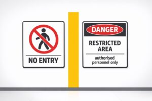
Restricted Area Signs vs. No Entry Signs
Compare No Entry and Restricted Area signs in Australian workplaces — meanings, design differences and AS 1319 compliance.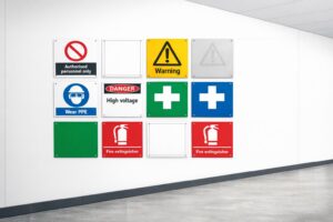
How to Spot Workplace Signage Gaps
Audit your workplace for missing, faded or non‑compliant signs under AS 1319 to reduce incidents and avoid WHS fines.
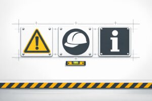
Symbol Design: Global Standards Explained
Explains ISO 7010 and ISO 3864: standard symbols, colours and sizing for clear, language‑free safety signage and AU compliance.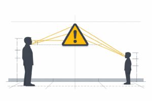
Hazard Sign Visibility Planner
Plan hazard sign placement for max visibility with our free tool. Ensure safety by finding the best spot, height, and angle—try it now!