Australian Standard AS1319: Visitor Signage Guide
The Australian Standard AS1319-1994 defines clear rules for safety signage in workplaces, ensuring hazards, emergency details, and required actions are easily understood. It categorises signs into six types: Prohibition, Mandatory, Danger, Warning, Emergency Information, and Fire Safety, with specific requirements for colour, shape, size, and placement.
Key points:
- Prohibition signs: Red circle with a slash, e.g., "No Entry."
- Mandatory signs: Blue circle, e.g., "Wear Safety Boots."
- Danger signs: Red and black, for life-threatening risks, e.g., "High Voltage."
- Warning signs: Yellow triangle for caution, e.g., "Slippery Floor."
- Emergency signs: Green background, e.g., "Exit."
- Fire signs: Red background, e.g., "Fire Extinguisher."
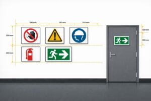
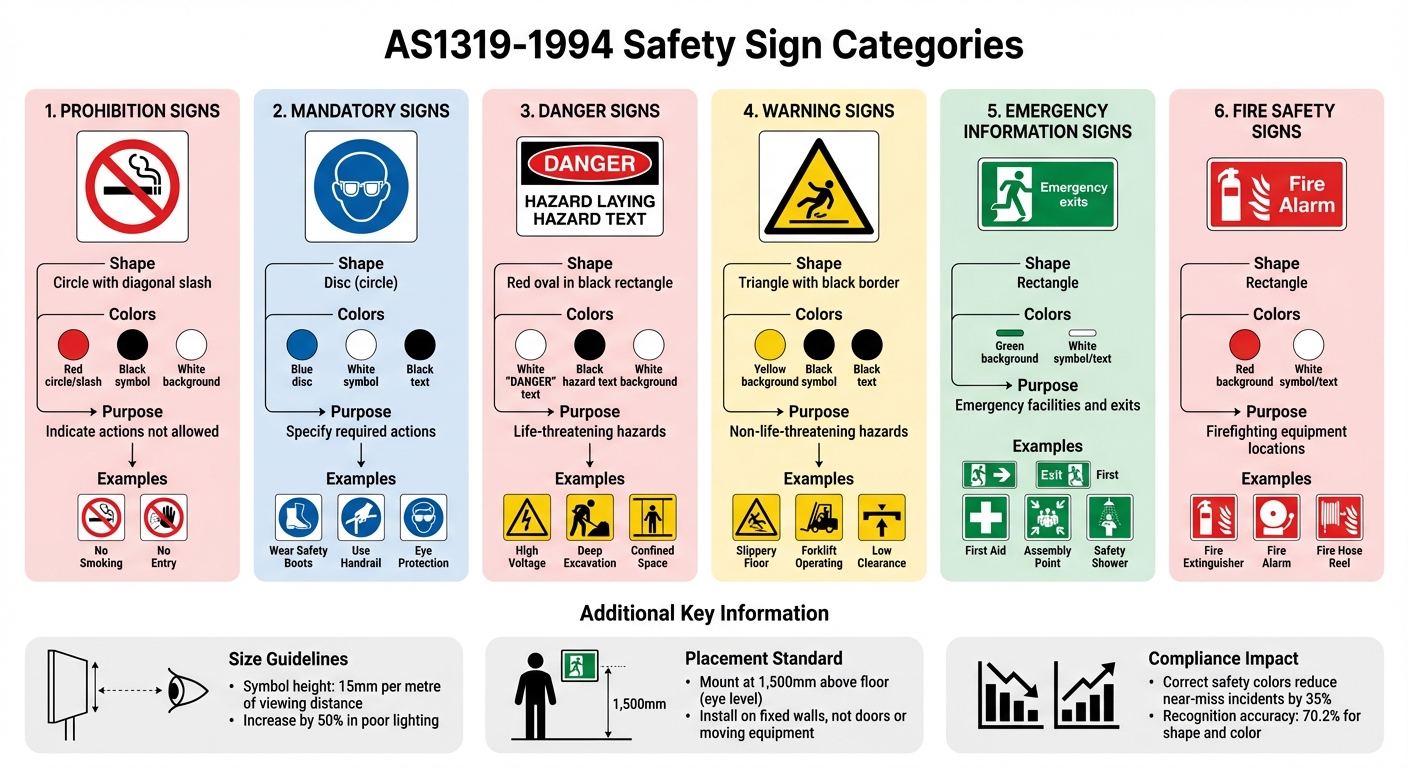
For compliance, signs must meet size guidelines (e.g., 15 mm symbol height per metre of viewing distance) and be placed at eye level (1,500 mm above the floor). Regular maintenance is critical to ensure visibility and adherence to the standard. Durable materials like aluminium or acrylic are recommended to withstand harsh conditions. Proper signage not only reduces risks but also demonstrates compliance with workplace safety laws in Australia.
AS1319 Australian Safety Sign Categories Guide
Safety Signage
Required Visitor Safety Signs
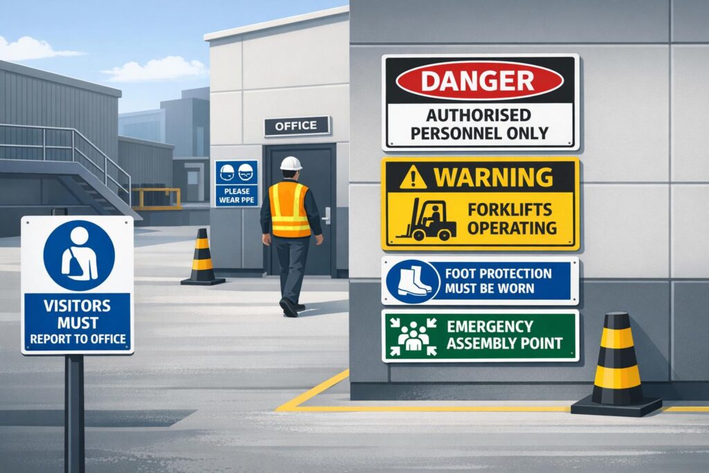
AS1319-1994 categorises workplace signs designed to protect visitors by providing clear instructions, warnings, and emergency information. These categories are structured by purpose, ensuring visitors can quickly recognise and respond to potential risks.
Choosing the appropriate signs begins with a comprehensive risk assessment. Identify hazards that visitors might encounter and evaluate their severity. For example, high-risk areas like construction sites may require signs for personal protective equipment, restricted zones, and warnings about moving machinery [7]. Below, we outline the key types of mandatory and warning signs, their designs, and placement requirements as per AS1319 standards.
Mandatory Signs for Visitors
After conducting a risk assessment, mandatory signs are used to clearly communicate essential behaviours to visitors. These signs are characterised by a white symbol on a blue circular background and often specify actions such as wearing eye protection, using handrails, or donning safety boots [5][8]. Unlike employees, who typically receive safety inductions, visitors depend on visible and understandable signage to know what is expected of them.
The blue colour of mandatory signs is designed to promote quick recognition and compliance. Studies show that people recognise the shape and colour coding of mandatory signs with a 70.2% accuracy rate, though understanding of the accompanying text drops to 56.13% [2].
Hazard Warning Signs
Warning signs are essential for alerting visitors to hazards that, while not immediately life-threatening, still require caution. These signs feature a yellow triangle with a black border and symbol or text [5][6]. They are commonly used to indicate risks such as slippery floors, forklift operation zones, low clearances, or trip hazards. The yellow colour is particularly effective in drawing attention, helping visitors notice potential dangers before encountering them [2].
In contrast to warning signs, Danger Signs are reserved for life-threatening risks. These signs prominently display the word "DANGER" in white letters on a red oval set within a black rectangle [5][6]. Typical examples include high-voltage areas, deep excavations, and confined spaces.
To ensure effectiveness, hazard signs should be positioned where visitors can see them well before entering the risk zone. Avoid placing signs on doors, windows, or movable equipment, as these can reduce visibility [8]. For optimal readability under good lighting, symbols should measure at least 15 mm per metre of viewing distance. In poor lighting conditions, this size should be increased by at least 50% [6].
| Sign Category | Visual Description | Purpose | Common Examples |
|---|---|---|---|
| Prohibition | Red circle with a slash over a black symbol on a white background | Indicate actions that are not allowed | No Smoking, No Entry |
| Mandatory | Blue circle with a white symbol | Specify required actions | Wear Safety Boots, Use Handrail, Eye Protection |
| Danger | Red oval in a black rectangle with "DANGER" in white | Highlight life-threatening hazards | High Voltage, Deep Excavation, Confined Space |
| Warning | Yellow triangle with a black border and symbol | Draw attention to non-life-threatening hazards | Slippery Floor, Forklift Hazard, Low Clearance |
| Emergency | Green background with white symbol/text | Identify emergency facilities | Exit, First Aid, Assembly Point, Safety Shower |
| Fire | Red background with white symbol/text | Indicate firefighting equipment locations | Fire Extinguisher, Fire Alarm, Fire Hose Reel |
Sign Types and Design Rules
AS1319-1994 divides safety signs into specific categories, each with clear design guidelines to ensure they are instantly recognisable. These guidelines rely on geometric shapes and colour schemes to create a visual system that communicates effectively with all visitors. The use of colours like red, yellow, blue, and green plays a key role in triggering quick recognition, especially in high-pressure situations [2]. This structured approach underpins the classification of signs outlined below.
5 Main Sign Categories
Understanding these categories helps simplify the process of selecting and placing signs to maintain visitor safety. The standard identifies five main categories, with fire signs often considered an additional sixth category.
- Prohibition signs: These are used to stop unwanted actions. They feature a red circle with a diagonal slash over a black symbol on a white background.
- Mandatory signs: These specify required actions or behaviours. They are represented by a blue disc with a white symbol and often include the word "MUST" in the accompanying text.
- Danger signs: Designed to warn about life-threatening hazards, these signs display the word "DANGER" in white letters on a red oval set within a black rectangle.
- Warning signs: These alert people to hazards that are not life-threatening, using a yellow triangle with a black border and symbol.
- Emergency information signs: These guide individuals to safety facilities, using white symbols or text on a green background [6].
"AS 1319 specifies that these signs are to be used where conditions are likely to be life threatening." – Safety Sign and Label [9]
Design Requirements by Category
Each sign category must meet the stringent safety standards outlined in AS1319. This includes adhering to specific text and symbol dimensions, which may need to be increased in low-light conditions. The standard also sets minimum luminance factors for safety colours: yellow (≥ 0.45), green (≥ 0.12), red (≥ 0.07), and blue (≥ 0.05). Research indicates that using these correct safety colours can reduce near-miss incidents by 35% in industrial settings [2].
Sign sizes are also matched to viewing distances for optimal visibility. For example:
- 300 × 225 mm signs are suitable for viewing distances up to 12 metres.
- 450 × 300 mm signs work for up to 18 metres.
- 600 × 450 mm signs are effective for distances up to 27 metres [1].
Signs should be placed close to the observer’s line of sight and set against contrasting backgrounds to ensure they stand out. Regular maintenance is essential, as faded or dirty signs lose their visibility and may no longer comply with safety standards.
| Sign Category | Shape | Background Colour | Symbol/Text Colour | Usage |
|---|---|---|---|---|
| Prohibition | Circle with diagonal slash | White | Red circle/slash; Black symbol/text | No Smoking, No Entry |
| Mandatory | Disc (circle) | White (text area) | Blue disc; White symbol; Black text | Wear Eye Protection, Use Handrail |
| Danger | Red oval in black rectangle | White (text area) | White "DANGER"; Black hazard text | High Voltage, Confined Space |
| Warning | Triangle with black border | Yellow | Black symbol and text | Slippery Floor, Forklift Operating |
| Emergency | Rectangle | Green | White symbol or text | Exit, First Aid, Assembly Point |
| Fire | Rectangle | Red | White symbol or text | Fire Extinguisher, Fire Hose Reel |
sbb-itb-9950c92
Sign Size and Placement Rules
Ensuring signs are the right size and in the right spot is essential for visibility and understanding. AS1319-1994 lays out clear formulas for determining sizes based on viewing distance and provides practical guidelines for proper mounting in real-world workplaces.
Text and Symbol Size Based on Distance
The size of pictograms and text on a sign depends on how far away it needs to be seen. According to the standard:
- Pictograms should measure at least 15 mm for every metre of viewing distance.
- Uppercase text should be at least 5 mm per metre.
- Lowercase text should measure 4 mm per metre [10][6][11].
For example, if someone needs to read a sign from 10 metres away, the pictogram should be at least 150 mm tall, and uppercase text should be at least 50 mm high.
These measurements assume good lighting and clear viewing conditions. If lighting is dim or visibility is otherwise compromised, increase all dimensions by at least 50% [6]. So, in the same 10-metre example but with poor lighting, the pictogram should be 225 mm, and uppercase text should be 75 mm tall.
Where to Mount Signs
Once the size is sorted, mounting the sign correctly is just as important. The standard suggests installing safety signs at 1,500 mm above the floor, which is roughly eye level for most adults [7].
"The sign must be still at all times. The preferred location for installation is a wall. Doors, racks, windows or any other moving equipment or tool are not the right spots to host a sign." – FCF National [8]
Always secure signs to fixed surfaces like walls. Avoid placing them on doors, racks, windows, or anything that moves. For fire extinguisher signs, there’s a specific rule: they should be mounted either next to or above the extinguisher and no higher than 2,000 mm from the floor [8].
Additionally, make sure signs are mounted against contrasting backgrounds. For instance, a white sign on a white wall won’t stand out and could go unnoticed. Place hazard signs well before the danger zone, and avoid overcrowding the area with too many signs, as this can overwhelm the viewer and reduce effectiveness [8].
Meeting AS1319 Compliance Standards
To meet AS1319 compliance, it’s essential to conduct regular inspections and use materials that can stand up to Australia’s tough environmental conditions. Together, these practices ensure safety signs remain effective and adhere to the required standards.
Regular Checks and Upkeep
Safety signs should always be clean, well-lit, and securely mounted as outlined in AS1319-1994 [6]. Routine inspections help identify signs that are faded, damaged, or otherwise compromised, reducing the risk of confusion or accidents. Signs that are peeling, cracked, or no longer legible should be replaced immediately. Outdated signs should also be removed to avoid clutter and mixed messages.
Proper placement is just as important. Signs should be mounted on stable surfaces, like walls, instead of doors or moving equipment, and positioned against contrasting backgrounds to ensure visibility. In areas with poor lighting, increasing the sign size by at least 50% can improve readability. By combining regular maintenance with high-quality materials, compliance becomes easier to maintain.
Choosing Durable Materials
While regular inspections address immediate issues, selecting durable materials ensures signs remain effective over the long haul. Materials that can withstand UV exposure, extreme weather, and general wear are crucial for maintaining compliance with AS1319 [6]. Using weak or unsuitable materials increases the risk of sign failure, which could jeopardise safety and emergency responses.
For durability, aluminium, stainless steel, and acrylic are excellent choices [12]. These materials are often tested in facilities like the Allunga Exposure Laboratory to confirm their ability to endure Australia’s harsh conditions. Companies like PXP Safety offer safety signs crafted from aluminium with UV-protective coatings and solvent-based outdoor printing, specifically designed to meet AS1319 standards and thrive in demanding environments.
Although durable materials may cost more upfront, they provide long-term savings by reducing the need for frequent replacements due to fading or damage [5]. This not only helps your workplace stay compliant but also minimises disruptions caused by maintenance and replacements.
Conclusion
Meeting the requirements of AS1319 is more than just a regulatory obligation – it’s about creating a workplace where hazards are easily recognised, and individuals can respond swiftly and effectively. The standard ensures that safety signs across Australian workplaces are consistent, easy to read, and effective. This uniformity promotes subconscious recognition, helping people react faster to potential dangers [4]. These steps not only improve safety but also reduce legal risks.
Failing to comply with AS1319 can lead to serious legal and financial consequences. Proper signage acts as proof that your business has taken reasonable measures to manage risks, which is crucial in defending against liability claims and maintaining valid insurance coverage [3].
Beyond legal considerations, the quality of materials used for safety signs is equally important. Choosing durable options, like aluminium with UV protection, minimises the need for frequent replacements and ensures long-term compliance. Companies like PXP Safety provide signs specifically designed to meet AS1319 standards while withstanding outdoor conditions. By adhering to these standards, you not only safeguard visitors but also reinforce your workplace’s overall safety measures.
FAQs
What is the difference between warning signs and danger signs under Australian Standard AS1319?
Warning and danger signs under AS1319 are designed to convey different levels of risk clearly and effectively, each with its own distinct appearance.
Warning signs are meant to alert people to hazards that, while concerning, are unlikely to cause life-threatening harm. These signs feature a black triangle with a yellow interior, accompanied by black symbols. Any text is displayed in black against the yellow background. You’ll often see these signs in situations like slippery floors or areas with low overhead clearance.
Danger signs, however, are reserved for hazards that pose a serious, life-threatening risk and require immediate attention. These signs are predominantly red, with black and white text, and they do not include symbols. Examples include warnings for high-voltage areas or zones with restricted access.
The key takeaway: warning signs are for non-fatal risks, while danger signs mark hazards that could result in severe injury or death. Ensuring your workplace signage aligns with AS1319 standards is essential for effectively communicating safety risks.
Where should safety signs be placed to ensure they are visible and compliant with AS 1319?
To make sure safety signs are both clearly visible and meet the requirements of AS 1319, they need to be placed where they can be easily seen and read without anything obstructing the view. The size of the sign should match the intended viewing distance. As a rule of thumb, the graphic height should be at least 15 mm for every metre of viewing distance. For instance, a sign meant to be read from 12 metres away should measure at least 300 mm × 225 mm.
Position signs at eye level, generally between 1.5 and 1.8 metres above the floor, and make sure they’re not hidden by objects like equipment or structural columns. For outdoor or brightly lit areas, consider using durable materials such as UV-protected aluminium to keep the sign legible over time. Adding a reflective finish can also improve visibility in dimly lit environments.
Additionally, follow the AS 1319 colour-coding system for quick and clear recognition: red for prohibition, yellow for warnings, blue for mandatory actions, and green for emergency information. Correct placement, appropriate sizing, and adhering to the colour standards are essential to ensure signs are effective and workplaces remain compliant with safety regulations.
What materials are best for safety signs used in tough outdoor environments?
When it comes to safety signs that must endure tough outdoor conditions, aluminium with a UV-protected coating stands out as a reliable choice. Its durability and resistance to weather-related wear make it ideal for long-term use. For temporary or short-term signage, corflute (corrugated plastic) is another practical option. It’s lightweight, resistant to corrosion, and easy to handle. Both materials are crafted to retain their visibility and quality, ensuring they meet safety standards even in demanding environments.
Related Blog Posts
You may also be interested in
FAQs About Workplace Safety Signs in Australia
AS 1319 sign types, placement, materials and maintenance for workplace safety and WHS compliance in Australia.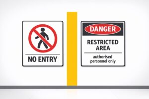
Restricted Area Signs vs. No Entry Signs
Compare No Entry and Restricted Area signs in Australian workplaces — meanings, design differences and AS 1319 compliance.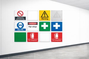
How to Spot Workplace Signage Gaps
Audit your workplace for missing, faded or non‑compliant signs under AS 1319 to reduce incidents and avoid WHS fines.
Symbol Design: Global Standards Explained
Explains ISO 7010 and ISO 3864: standard symbols, colours and sizing for clear, language‑free safety signage and AU compliance.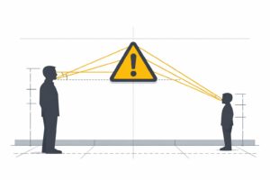
Hazard Sign Visibility Planner
Plan hazard sign placement for max visibility with our free tool. Ensure safety by finding the best spot, height, and angle—try it now!