AS 1319 Safety Sign Colours Explained
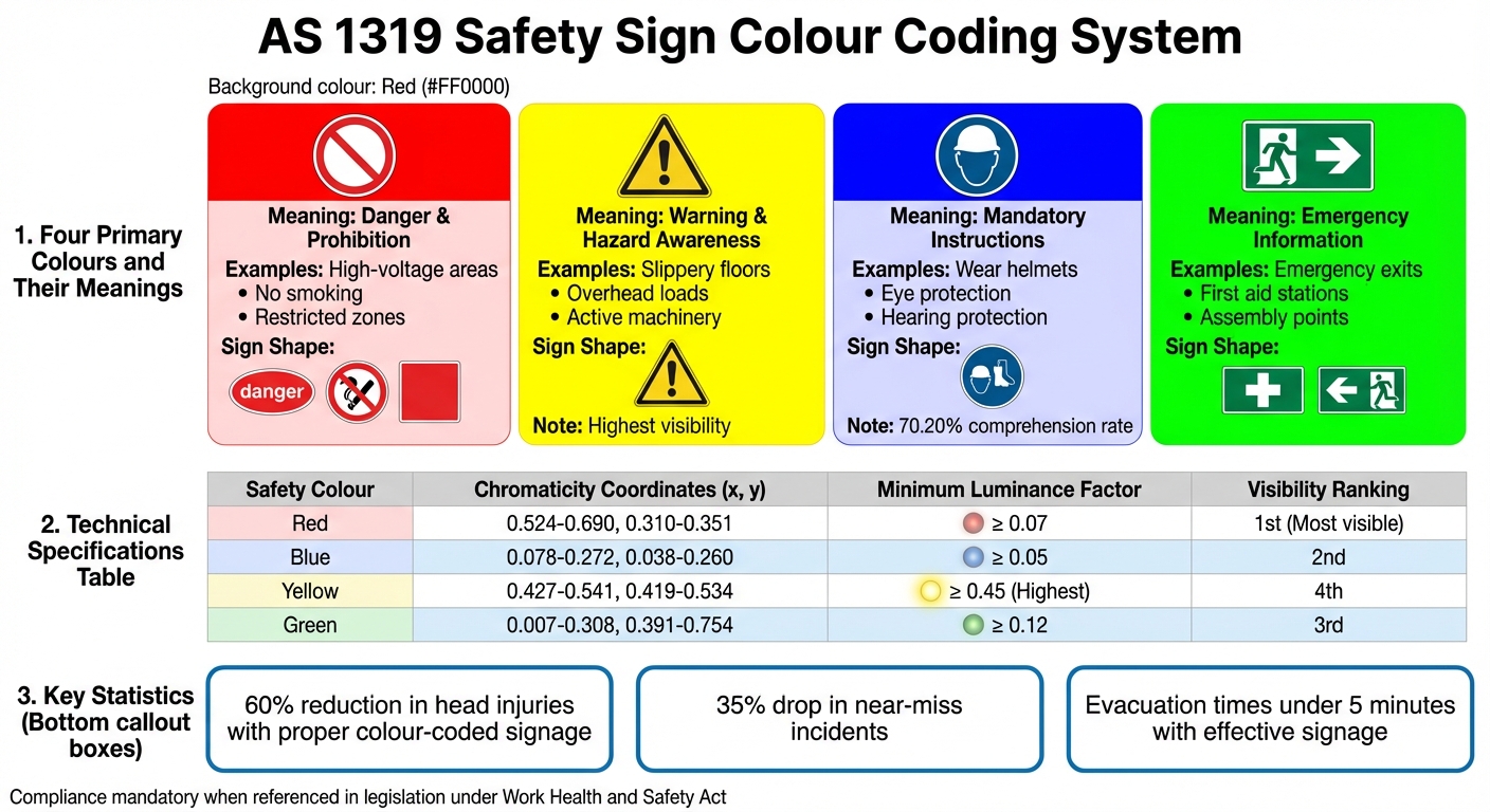
AS 1319 sets the standard for workplace safety signs in Australia, focusing on colour coding, design, and usage to improve hazard awareness and communication. The system uses four primary colours:
- Red: Indicates danger or prohibition (e.g., high-voltage areas, no smoking).
- Yellow: Warns of potential hazards (e.g., slippery floors, overhead loads).
- Blue: Specifies mandatory actions (e.g., wear helmets or eye protection).
- Green: Provides emergency information (e.g., exits, first aid stations).
This standard ensures uniformity across workplaces, helping workers quickly recognise and respond to hazards. Although compliance is typically voluntary, it becomes mandatory when referenced in legislation. Misusing colours or poorly maintained signs can lead to safety risks and legal penalties.
Signs must also meet technical specifications for colour visibility, luminance, and placement to remain effective in various lighting conditions. For example, yellow has the highest luminance (≥0.45), making it ideal for caution signs, while red is used for urgent warnings despite lower luminance (≥0.07). Proper maintenance, including regular cleaning and placement at eye level, is crucial for compliance.
Key takeaway: Adhering to AS 1319 ensures safer workplaces by providing clear, standardised safety messaging through effective colour-coded signage.
The Different Colours Of Safety – What Safety Sign Colours Mean – Occupational Health and Safety
The AS 1319 Colour Coding System

AS 1319 Safety Sign Colour Coding System and Technical Specifications
AS 1319 outlines four key colours that form the foundation of workplace safety signage across Australia. Each colour carries a distinct meaning, creating a visual system that workers can quickly understand, even in high-pressure situations.
The standard specifies precise chromaticity and luminance values to ensure signs are visible and consistent under various lighting conditions [1]. This means a red danger sign in Perth will look the same as one in Brisbane, maintaining uniformity across all workplaces.
Research shows that red stands out the most, followed by blue, green, and yellow in terms of visibility [1]. This hierarchy influences how colours are assigned to safety messages, particularly in environments with numerous visual distractions. Studies in semiotic psychology suggest that colours play a critical role in how people process safety messages, with certain hues prompting quicker reactions under stress [1]. For instance, a virtual reality study revealed that green and black were favoured for emergency signs, as participants associated green with safety and located exits more quickly when green was used [1].
Here’s a breakdown of what each colour represents in the AS 1319 system:
Red: Danger and Prohibition
Red is used to signal immediate danger and to warn against actions that could cause severe injury. It’s commonly found on signs for high-voltage areas, dangerous machinery, or restricted zones. The boldness of red commands attention, prompting workers to pause and assess the situation.
Prohibition signs also rely on red to indicate forbidden behaviours. For example, no smoking signs typically feature a red circle with a diagonal line, making the restriction unmistakable. Danger signs often combine red with specific shapes, like a red oval inside a black rectangle, to ensure instant recognition without needing to rely solely on text [1].
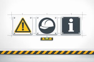
Yellow: Warning and Hazard Awareness
Yellow serves as a cautionary colour, alerting workers to potential risks that require attention but don’t pose an immediate threat. You’ll often see yellow signs in areas with slippery floors, overhead loads, or active machinery. Its high visibility draws attention without causing the urgency associated with red [1].
AS 1319 specifies that warning signs use a yellow triangle with black borders. This design has been shown to improve recognition and allow workers to identify hazards early, helping to prevent accidents [1].
Blue: Mandatory Instructions
Blue is used to indicate mandatory safety actions. Unlike red or yellow, it doesn’t signal danger but instead communicates essential behaviours, such as wearing helmets, eye protection, or hearing protection.
Mandatory signs feature a blue circle, often paired with white pictograms to clearly illustrate the required action. This straightforward design ensures workers understand the instructions without confusion [1].
Green: Emergency Information
Green is reserved for emergency-related information, guiding workers to first aid stations, emergency exits, eyewash stations, or assembly points. Its association with safety and permission makes it an obvious choice for emergency signage.
Emergency signs typically use green rectangles or squares, creating a consistent and recognisable cue. In high-stress situations like evacuations, the familiarity of green emergency signs helps workers locate safety resources quickly, reducing response times [1].
Technical Specifications for Safety Colours
AS 1319 lays out detailed requirements for chromaticity coordinates and minimum luminance factors for safety colours, ensuring that a warning sign in Darwin performs just as effectively as one in Melbourne, regardless of the lighting conditions.
The chromaticity coordinates define each colour’s precise hue and saturation, while luminance factors measure how much light a colour reflects. Among the safety colours, yellow stands out with the highest minimum luminance factor of ≥ 0.45, making it highly visible in different lighting conditions. Green follows with a minimum luminance of ≥ 0.12, then red at ≥ 0.07, and finally blue, which requires ≥ 0.05. These specifications ensure that each colour is used appropriately: yellow’s brightness is perfect for cautionary messages, while red’s lower luminance still effectively conveys danger. AS 1319 also includes standards for size and placement to maximise the effectiveness of these signs.
| Safety Colour | Chromaticity Coordinates (x, y) Range | Minimum Luminance Factor |
|---|---|---|
| Red | Approx. (0.524 to 0.690, 0.310 to 0.351) | ≥ 0.07 |
| Blue | Approx. (0.078 to 0.272, 0.038 to 0.260) | ≥ 0.05 |
| Yellow | Approx. (0.427 to 0.541, 0.419 to 0.534) | ≥ 0.45 |
| Green | Approx. (0.007 to 0.308, 0.391 to 0.754) | ≥ 0.12 |
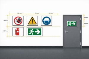
AS 1319 also specifies minimum sizing requirements based on viewing distance. For example, symbols must be at least 15 mm per metre of viewing distance, while uppercase text must be at least 5 mm per metre. This means a sign viewed from 10 metres away should have symbols at least 150 mm tall and text at least 50 mm high. In settings with poor lighting or visual clutter, these dimensions should be increased by 50% to maintain clarity [5].
To further ensure effective hazard communication, the standard includes guidelines for placement and maintenance. Signs should be mounted near eye level, positioned against contrasting backgrounds, and free from obstructions [5]. Regular cleaning and proper lighting are also critical – dirty or faded signs not only reduce visibility but also fail to meet compliance standards. While AS 1319 does not specify materials or durability requirements, it does stress that signs must be suitable for their intended use and remain effective over time [5].
sbb-itb-9950c92
Sign Shapes and Layouts Based on Colour
AS 1319 doesn’t just rely on colour to convey safety messages – it pairs colours with specific shapes to make these signs even more recognisable and effective.
Take red, for instance. It’s the colour of immediate danger, and its shapes are designed to grab attention instantly. Danger signs use red ovals, prohibition signs feature red circles with a diagonal slash, and fire safety signs are red squares. Each shape reinforces the urgency of the message [1].
Yellow, the universal colour for caution, is paired with triangular signs edged in black. Inside the triangle, a black pictograph provides a clear warning. This combination has become a visual shorthand for "be alert" [1].
For mandatory actions, blue takes centre stage. These signs use a blue circle containing a white pictograph on a white background. Research shows that workers understand these designs 70.20% of the time, showcasing their effectiveness in conveying instructions [1].
Emergency information signs, on the other hand, use green rectangles or squares. These signs include white text or pictographs that guide people to safety – whether it’s an emergency exit, a first aid station, or a safe zone. A virtual reality study highlighted the efficiency of green exit signs, with participants identifying them faster than red ones during emergencies [1].
Restriction signs also have a distinct format under AS 1319. Unlike prohibition signs, these use a red circle without a diagonal slash. Inside, they feature a black pictograph or text on a white background. A common example would be speed limit signs [1].
This system of standardised colours and shapes ensures consistency across Australian workplaces. It reduces confusion and helps people quickly grasp safety messages. Studies conducted at Australian beaches further confirm this: signs with bold colours and clear symbols are easier to notice, and red remains the most effective colour for drawing attention to critical warnings [1].
Meeting AS 1319 Compliance Requirements
AS 1319-1994 sets the standards for workplace safety signage in Australia. When these standards are referenced in State and Commonwealth legislation, compliance isn’t optional – it’s required under the Work Health and Safety Act [4]. These guidelines establish the rules for sign design, placement, and upkeep, ensuring workplaces remain safe and hazards are clearly communicated.
The first step to compliance is choosing the right signs for your specific workplace hazards. AS 1319 outlines everything from colour codes and shapes to symbol designs and placement rules. Misusing colours or symbols can lead to confusion, increase the risk of accidents, and even result in penalties [4].
Proper placement is just as important as the design of the signs. Signs must be positioned where they are easily noticed – close to eye level and against a contrasting background to maximise visibility. They should be placed near hazards, at entry points, by dangerous machinery, and around emergency exits to ensure they serve their purpose effectively.
Maintaining your signage is a key part of staying compliant. Regular checks are necessary to confirm that signs remain clear, bright, and easy to read. Faded or damaged signs can compromise safety and may lead to breaches of compliance.
In some cases, standard signage might not be enough. That’s when customised solutions come into play.
Custom and Durable Safety Signs
Custom signs are essential for addressing unique hazards that standard templates don’t cover. For instance, in the construction industry, builder’s signs at site entrances are required by law to display licence numbers and contact details. These signs must also be durable, clearly visible, and suitable for the specific environment [3].
Durability is particularly important in Australia, where harsh conditions like UV exposure, extreme temperatures, and severe weather can quickly wear down inferior signage. Replacing damaged signs frequently can become an expensive burden [2].
To tackle this, PXP Safety offers compliant signage designed to withstand Australia’s tough climate. Using durable aluminium with UV-protected outdoor printing, their signs are built for longevity. Their custom sign service ensures businesses can address specific hazards while staying fully compliant with AS 1319. These signs are designed to remain effective year after year, even in the most challenging environments.
Conclusion
Grasping the AS 1319 colour coding system goes beyond ticking compliance boxes – it’s about fostering safer workplaces where hazards are quickly identified and addressed. Each colour serves a distinct purpose: red signals danger, yellow highlights potential risks, blue enforces mandatory actions, and green provides emergency information. These colours act as instant visual cues, often making the difference between a routine day and a preventable accident.
Studies reveal that workplaces adhering to proper colour-coded signage standards see a 60% reduction in head injuries and a 35% drop in near-miss incidents [1]. Additionally, well-placed and effective signage can cut emergency evacuation times to under five minutes, proving how critical these signs are in safeguarding lives [1].
"Red gets your attention and means something is urgent." – OPTRAFFIC [1]
These statistics and insights highlight the importance of compliant signage in maintaining workplace safety.
AS 1319-compliant signage ensures clear, immediate communication [1]. With its emphasis on precise colour standards, durability, and proper placement, these signs not only protect workers but also help businesses meet health and safety obligations without frequent replacements [4].
For organisations seeking signage that can endure Australia’s tough conditions while meeting AS 1319 standards, PXP Safety (https://pxpsafety.com.au) offers durable, custom-designed solutions tailored to these needs.
FAQs
What are the risks of not complying with AS 1319 safety signage standards in the workplace?
Failing to meet the requirements of AS 1319 safety signage standards can have serious repercussions for any workplace. Non-compliance may expose businesses to legal penalties, heighten the likelihood of workplace accidents, and create unnecessary confusion, particularly in emergency situations. If incidents arise due to missing, incorrect, or insufficient signage, employers could also be held liable.
Adhering to these standards by using compliant safety signs is essential. It not only helps safeguard employees and reduces potential hazards but also ensures that businesses fulfil their legal responsibilities under Australian safety laws. Effective signage plays a vital role in maintaining both a safe and productive workplace.
How can I make sure my safety signs are easy to see in all lighting conditions?
To make sure your safety signs stand out in all lighting conditions, try increasing their size by 50% and choose high-contrast colours to improve readability. In dimly lit areas, adding external or internal lighting can significantly boost visibility.
It’s also important to position signs at eye level and keep them clear of obstructions like furniture or equipment. These measures will help ensure the signs are effective and meet safety regulations.
Why is it essential to use the correct colours and shapes for safety signs?
Using the right colours and shapes for safety signs is crucial for clearly communicating hazards, safety instructions, and emergency information. These signs are designed to be easily recognised, helping people act quickly and appropriately in urgent situations.
Following the Australian Standards (AS 1319) ensures workplaces stay compliant, minimises the chance of accidents, and supports a safer environment for everyone. By sticking to these standards, businesses can establish a safety system that is both effective and dependable.
Related Blog Posts
You may also be interested in
FAQs About Workplace Safety Signs in Australia
AS 1319 sign types, placement, materials and maintenance for workplace safety and WHS compliance in Australia.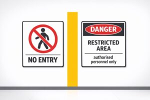
Restricted Area Signs vs. No Entry Signs
Compare No Entry and Restricted Area signs in Australian workplaces — meanings, design differences and AS 1319 compliance.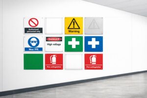
How to Spot Workplace Signage Gaps
Audit your workplace for missing, faded or non‑compliant signs under AS 1319 to reduce incidents and avoid WHS fines.
Symbol Design: Global Standards Explained
Explains ISO 7010 and ISO 3864: standard symbols, colours and sizing for clear, language‑free safety signage and AU compliance.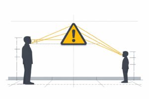
Hazard Sign Visibility Planner
Plan hazard sign placement for max visibility with our free tool. Ensure safety by finding the best spot, height, and angle—try it now!